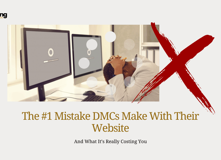
Every DMC knows itineraries are their core product. They’re the moment where expertise meets perception… and perception drives approvals. Yet most DMCs unknowingly sabotage themselves with the one document that matters most: the itinerary PDF. The #1 Mistake DMCs Make With Their Itinerary PDFs Is not because of the content. But because of the workflow behind it.
Let’s talk about the mistake that’s slowing down approvals, weakening client confidence, and quietly damaging your brand.
The Industry Habit That’s Holding DMCs Back
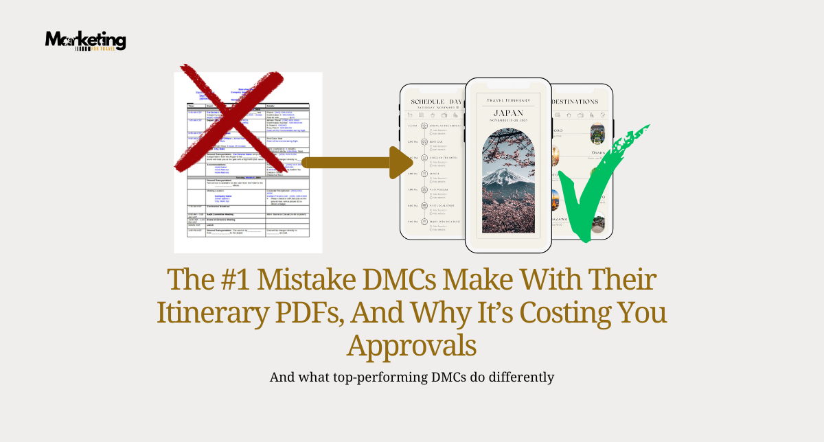
Most DMCs still build itineraries using old Word or PowerPoint templates, then export them as PDFs.
This legacy workflow:
- Forces outdated branding
- Creates slow, manual revision cycles
- Makes it impossible to scale
- Locks teams into inconsistent formatting
- Produces “busy” documents that overwhelm advisors
The problem isn’t design, it’s the system behind the design. What looks like a simple formatting issue is actually a friction point across your whole business:
- Itineraries with weak visual hierarchy
- Confusion around inclusions, logistics, or payments
- Unnecessary back-and-forth with advisors
- Cluttered layouts that frustrate luxury travelers
- No clear pathway to quick approval
- Support teams drowning in avoidable questions
When your proposal is unclear, your operations look unclear.
Modern Client Expectations Have Changed
Travel advisors and luxury clients now expect:
- Clean, minimal layouts
- Mobile-first formats
- Modern typography
- Quick-scanning sections
- Intuitive flow
- Visual clarity
If your itinerary doesn’t meet those standards, they assume your service won’t either.
Executives might not articulate it, but they feel it immediately:
A cluttered itinerary implies disorganized operations. A clean itinerary communicates reliability and professionalism.
Your design becomes a proxy for your backend systems.
Do not forget this, today DESIGN = TRUST
The Solution: A Modular, Visual Itinerary System
The best DMCs are moving away from text-heavy documents and toward itineraries built on:
✔ Consistent brand elements
✔ Defined layout structure
✔ Predictable flow
✔ Mobile adaptability
✔ Modular day-by-day blocks
This isn’t just aesthetics, it’s architecture for growth. High-converting, premium itineraries include:
- High-quality destination visuals
- Color-coded sections by day/theme
- Icons for logistics, meals, activities, transfers
- Clear timelines and summaries
- Fast-scanning highlights
This gives advisors the clarity they need to approve faster.
THE BUSINESS IMPACT
DMCs using modern visual itineraries report:
⭐ Up to 40% faster approval cycles
⭐ Fewer clarifying emails
⭐ Stronger advisor confidence
⭐ Higher close rates (especially in luxury markets)
⭐ Better repeat business
In a competitive market, clarity sells. Speed sells. Professionalism sells.
Curious how “modern” your itinerary actually looks from a client’s perspective?
Request a call with our team and we can help.